Art & About Sydney

Art & About brings temporary art and exhibitions into Sydney’s public spaces, inviting people to encounter something unexpected in familiar surroundings. Its identity needed to draw attention to individual events while helping audiences recognise the programme connecting them.

We built on the existing mark and developed a system that could accommodate different artworks, imagery and tones throughout the year.

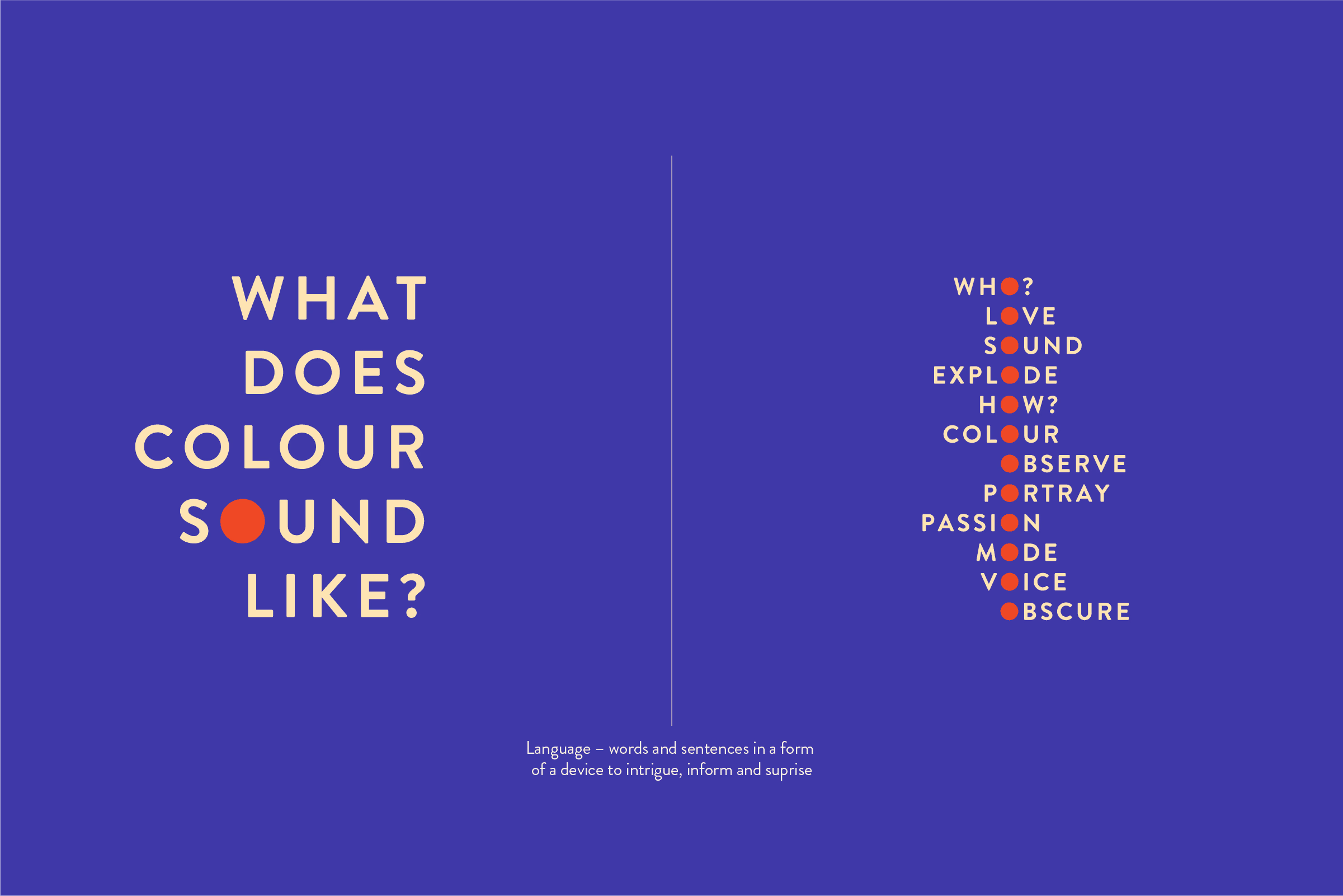
Language became an active part of the identity: asking questions, introducing ideas and inviting participation. Circular forms provided a flexible toolkit for framing photographs, creating patterns and organising content.

Together, these elements gave each event room for its own character within a recognisable programme. They also gave the team reusable tools for promoting new work as the calendar changed, maintaining continuity across different events and applications.
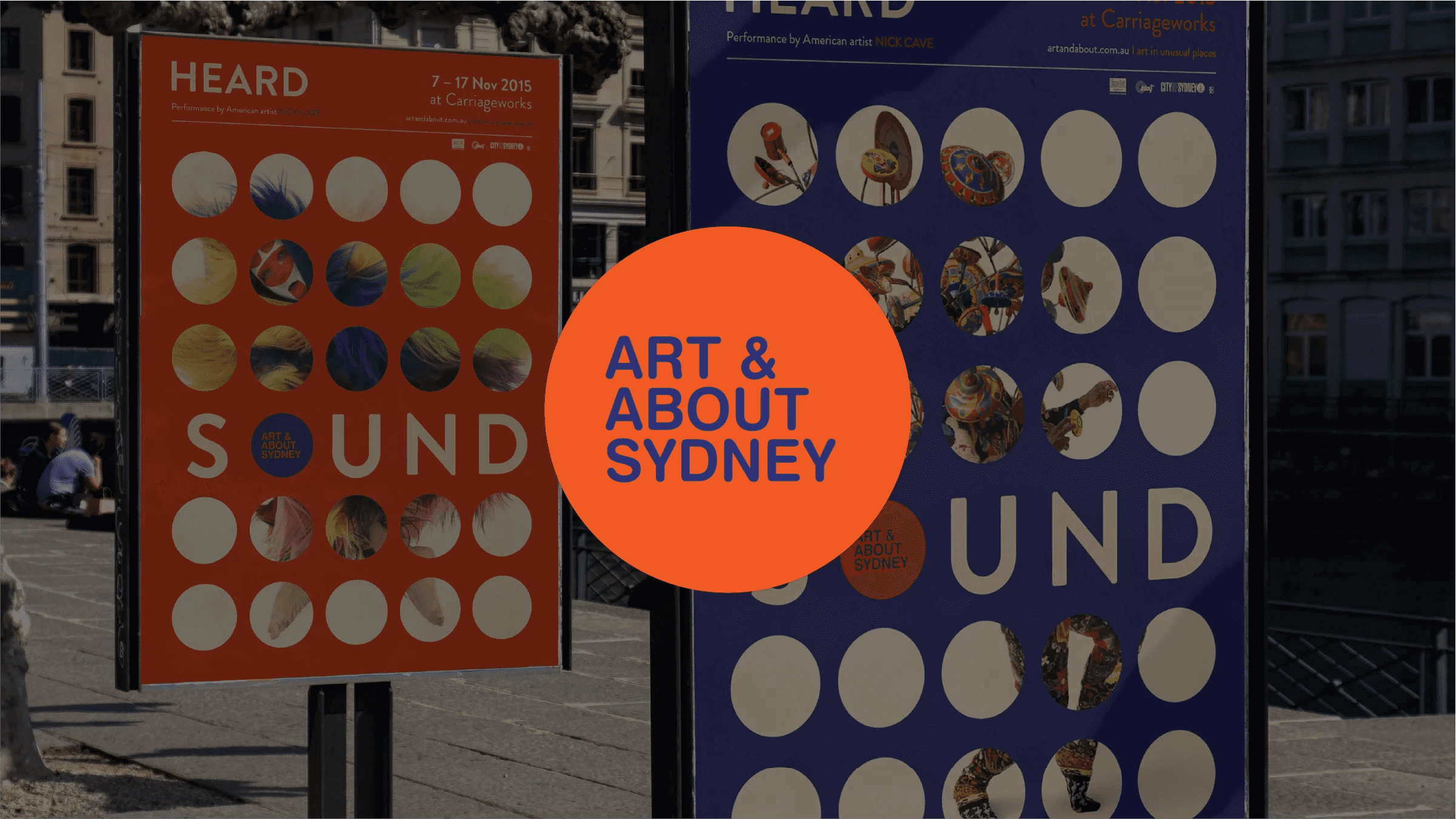
Art & About Sydney identity over colourful public art posters.
Typographic system asking what does colour sound like, with orange letter accents.
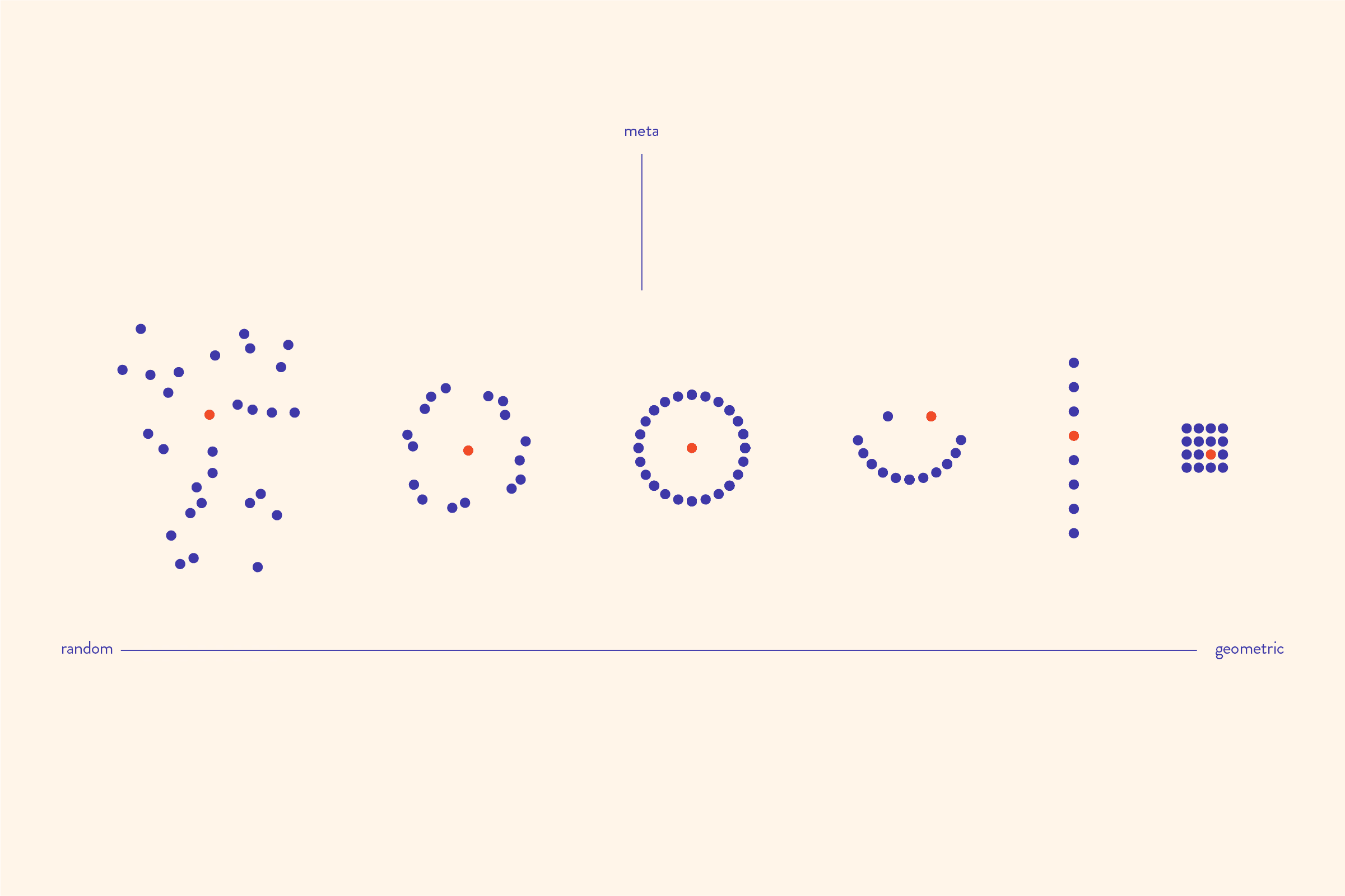
Dot-based graphic experiments arranged from random to geometric.
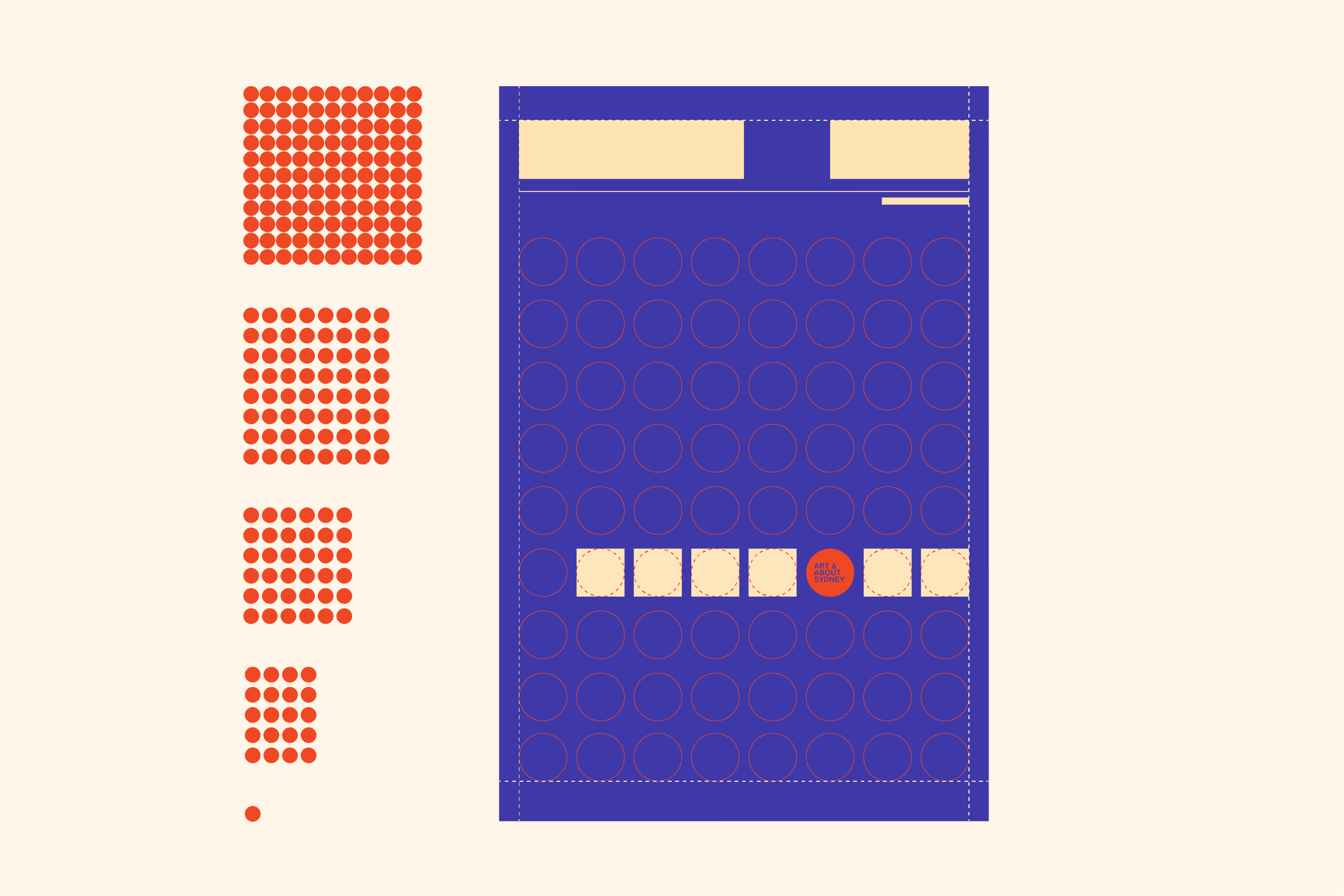
Poster grid construction with dots, circles, and colour blocks.
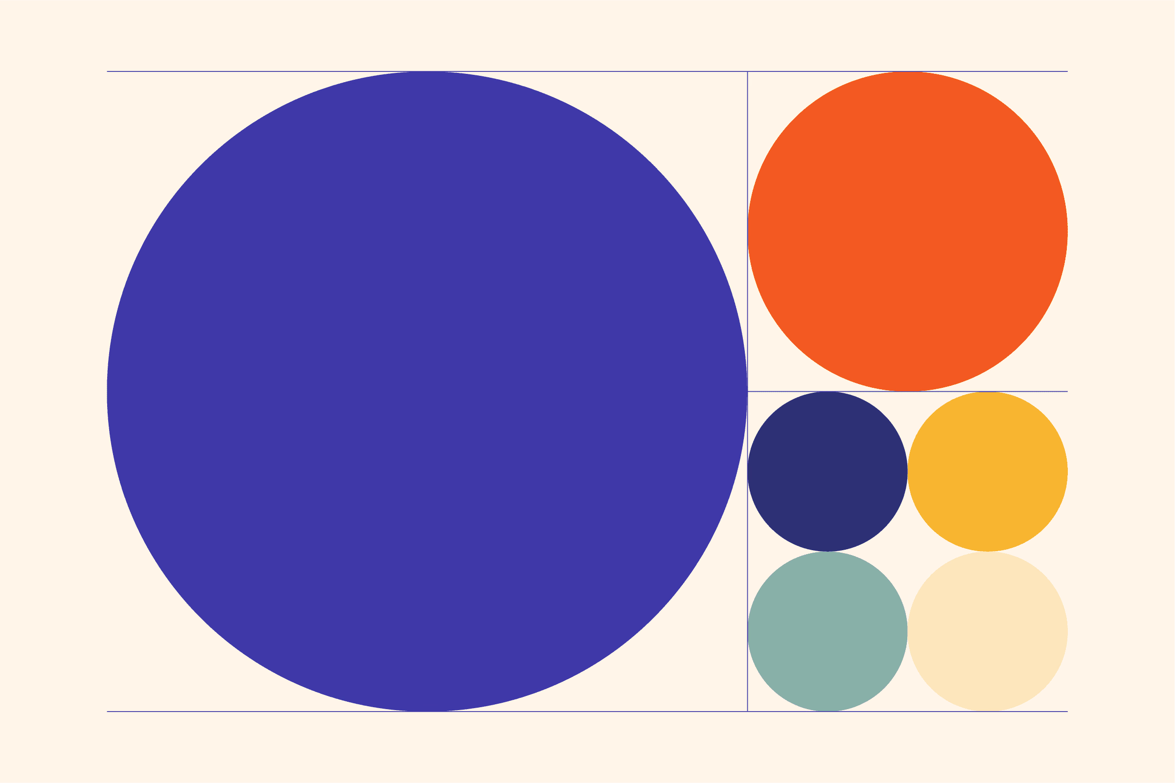
Brand colour palette represented by differently sized circles.
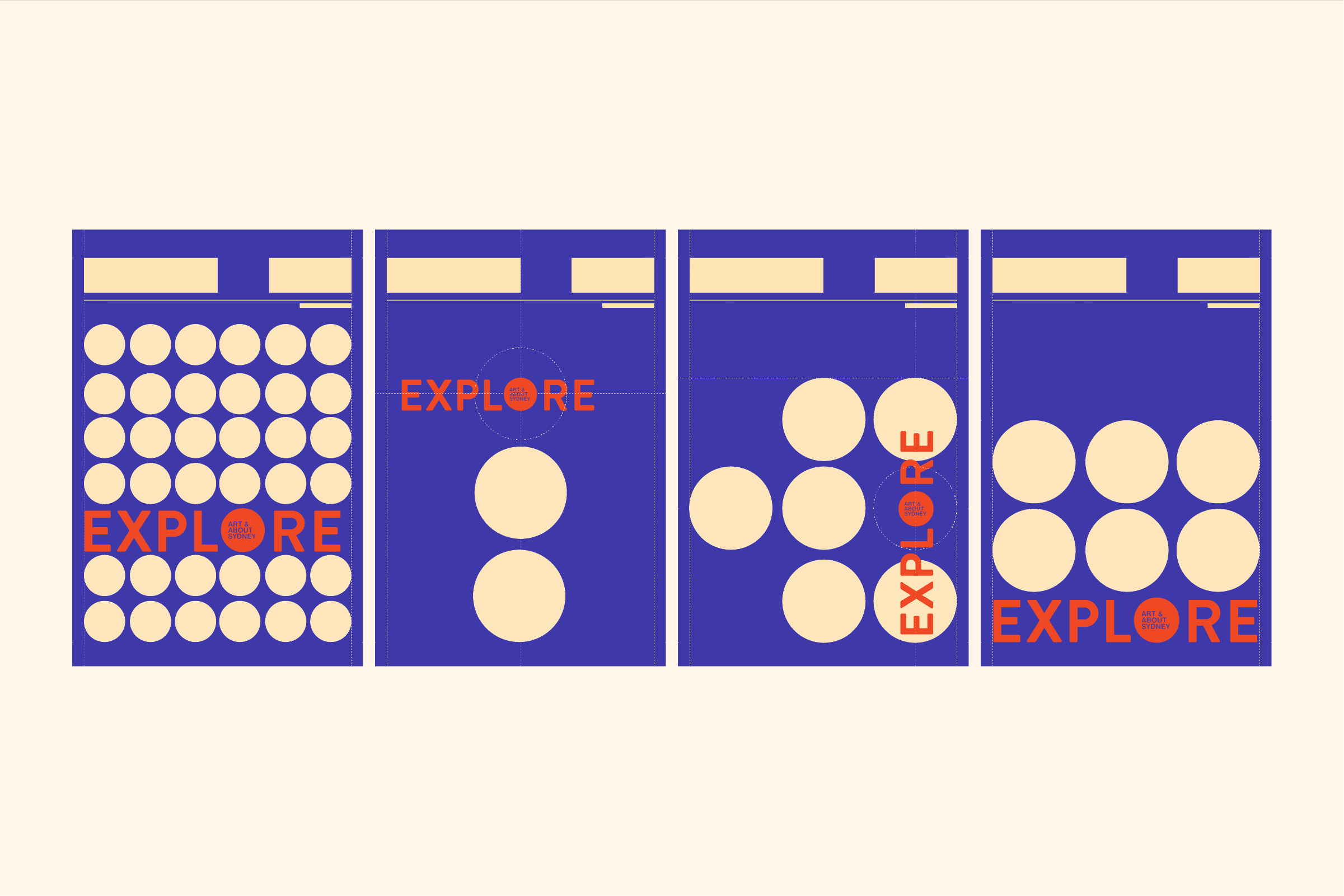
Four Explore poster layouts using varied circular grids.
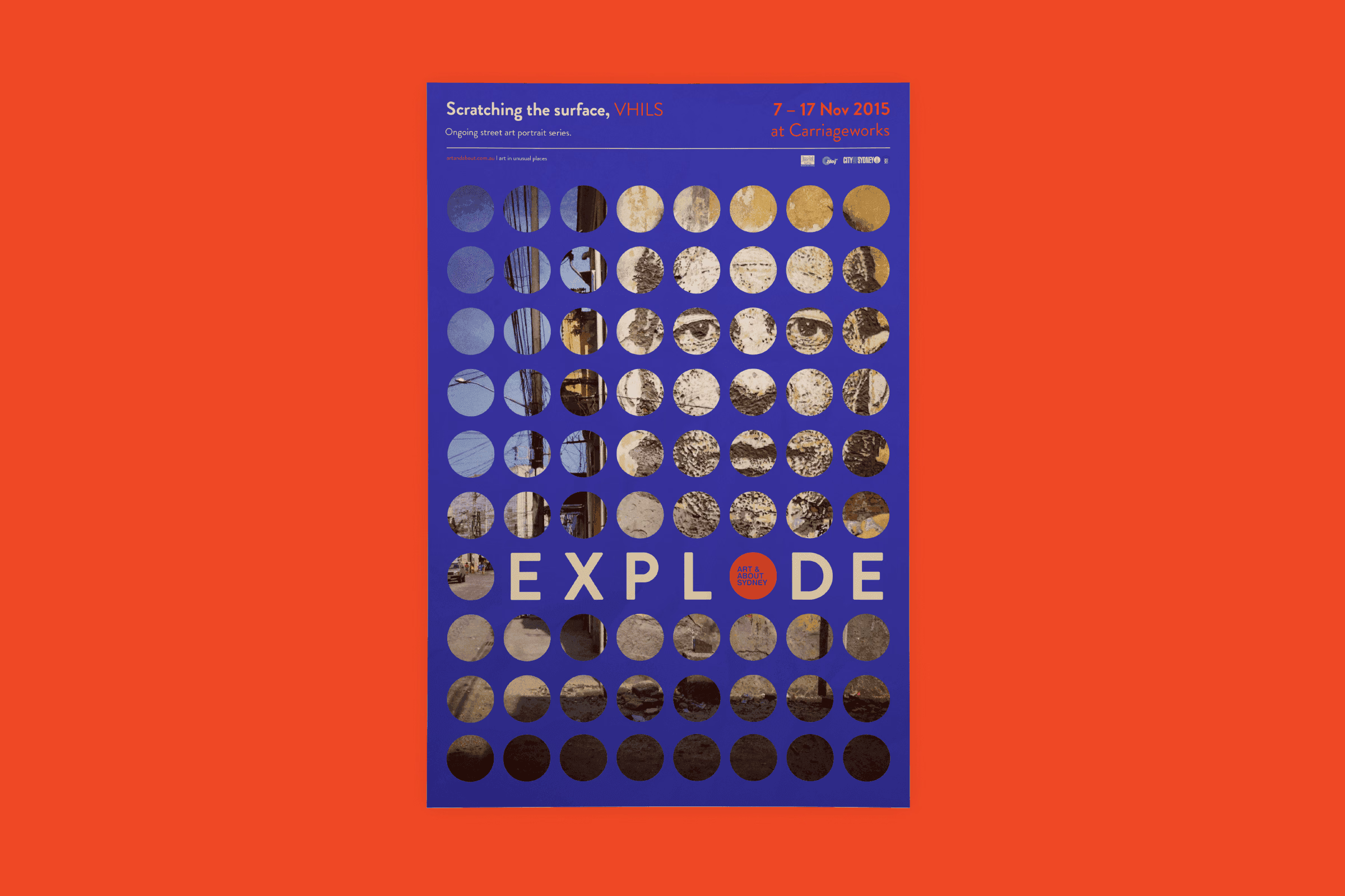
Scratching the Surface poster with circular artwork fragments.
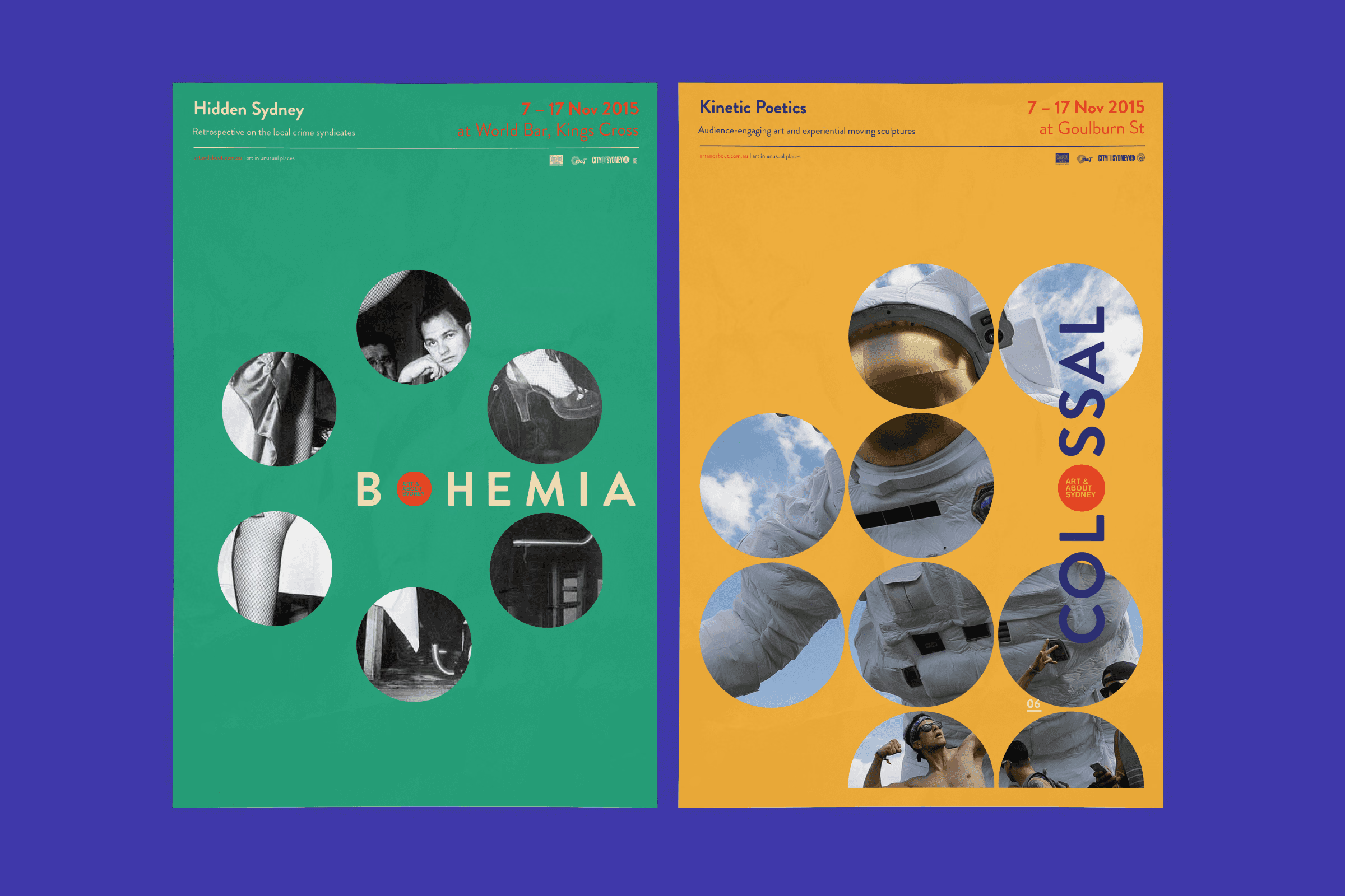
Bohemia and Colossal exhibition posters in green and yellow.
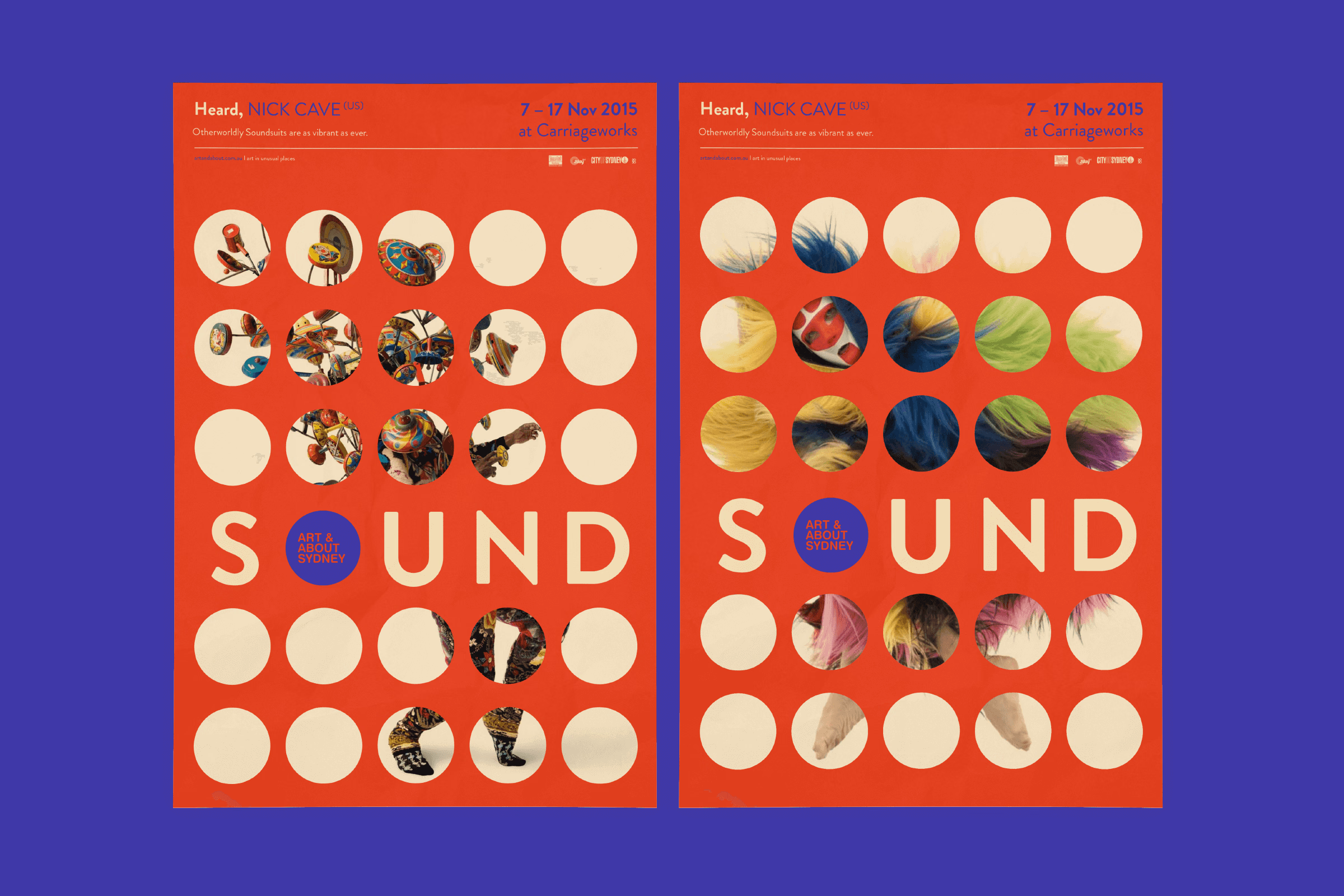
Two Sound posters featuring circular artwork fragments on orange.
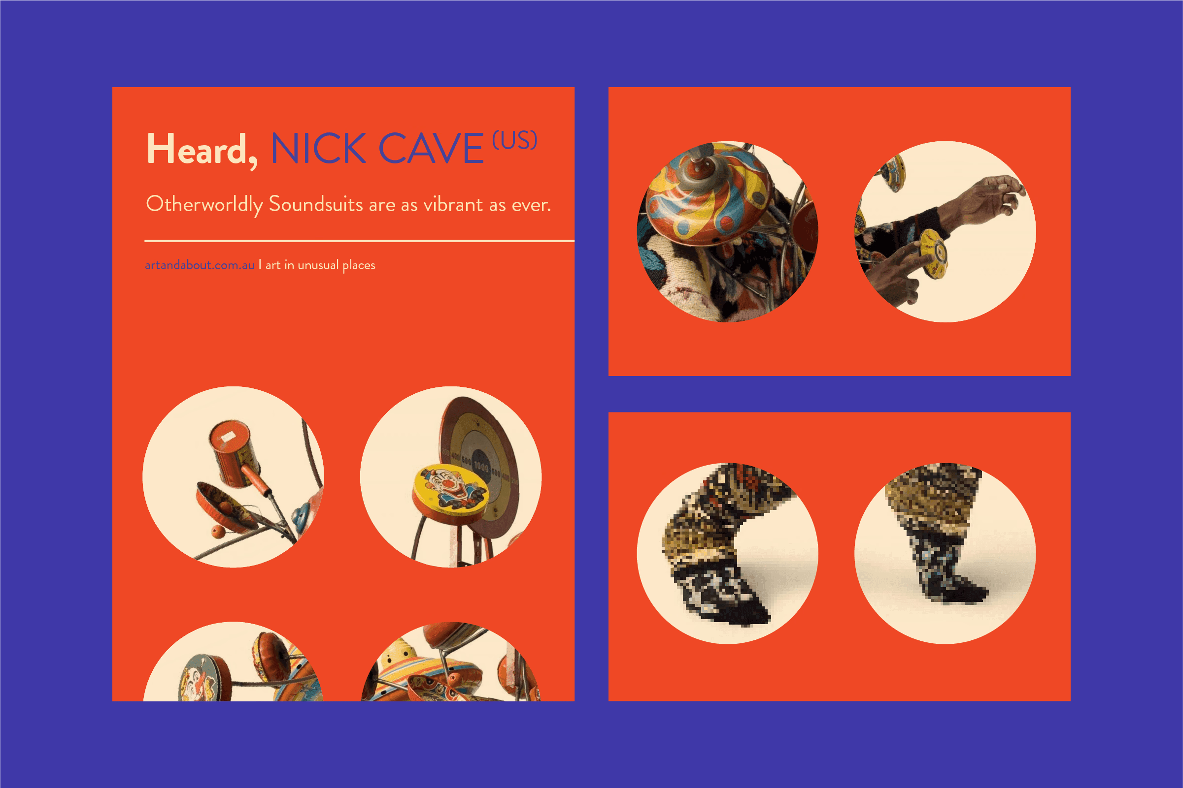
Nick Cave exhibition poster and related promotional graphics.
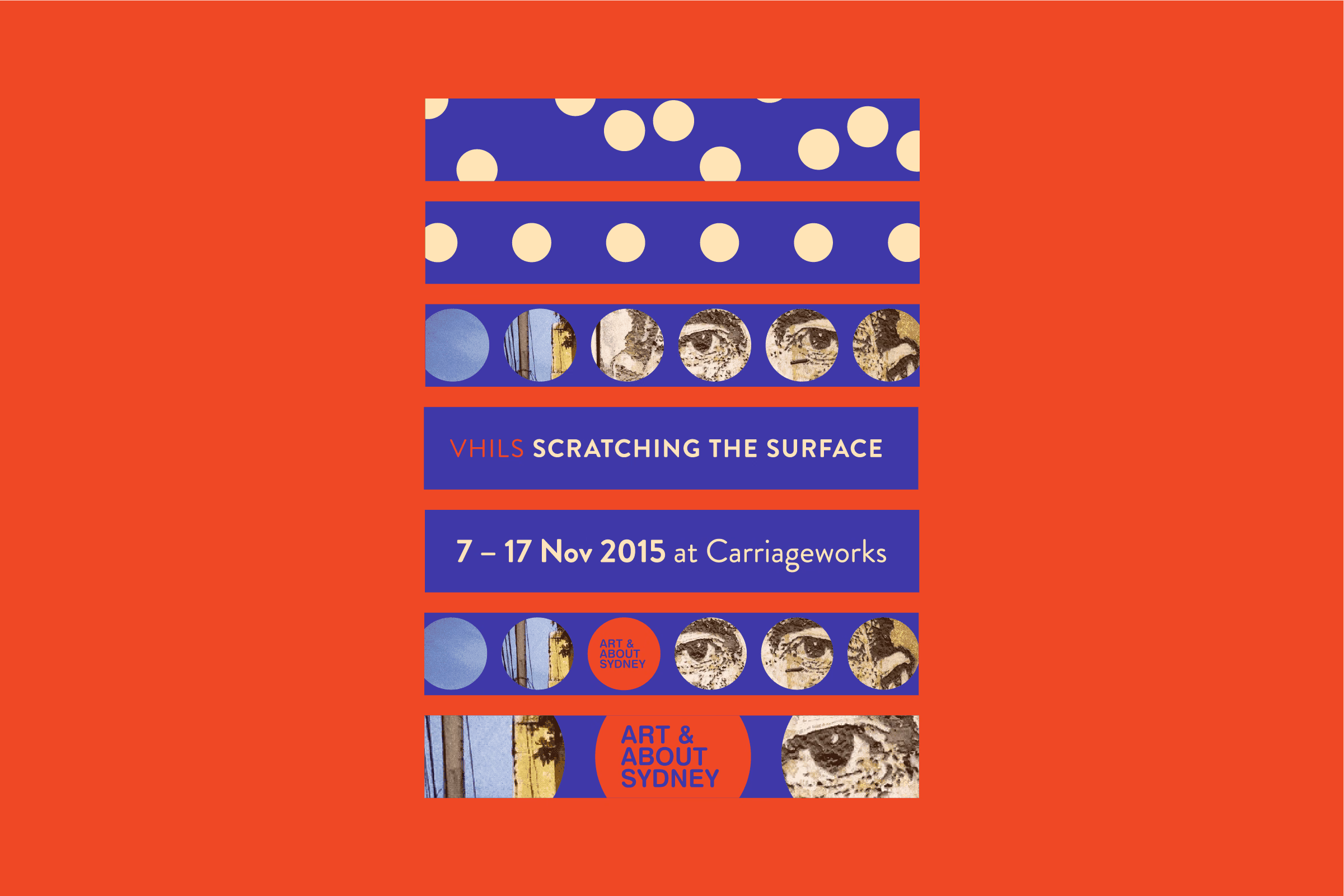
Scratching the Surface event flyer with patterned bands.
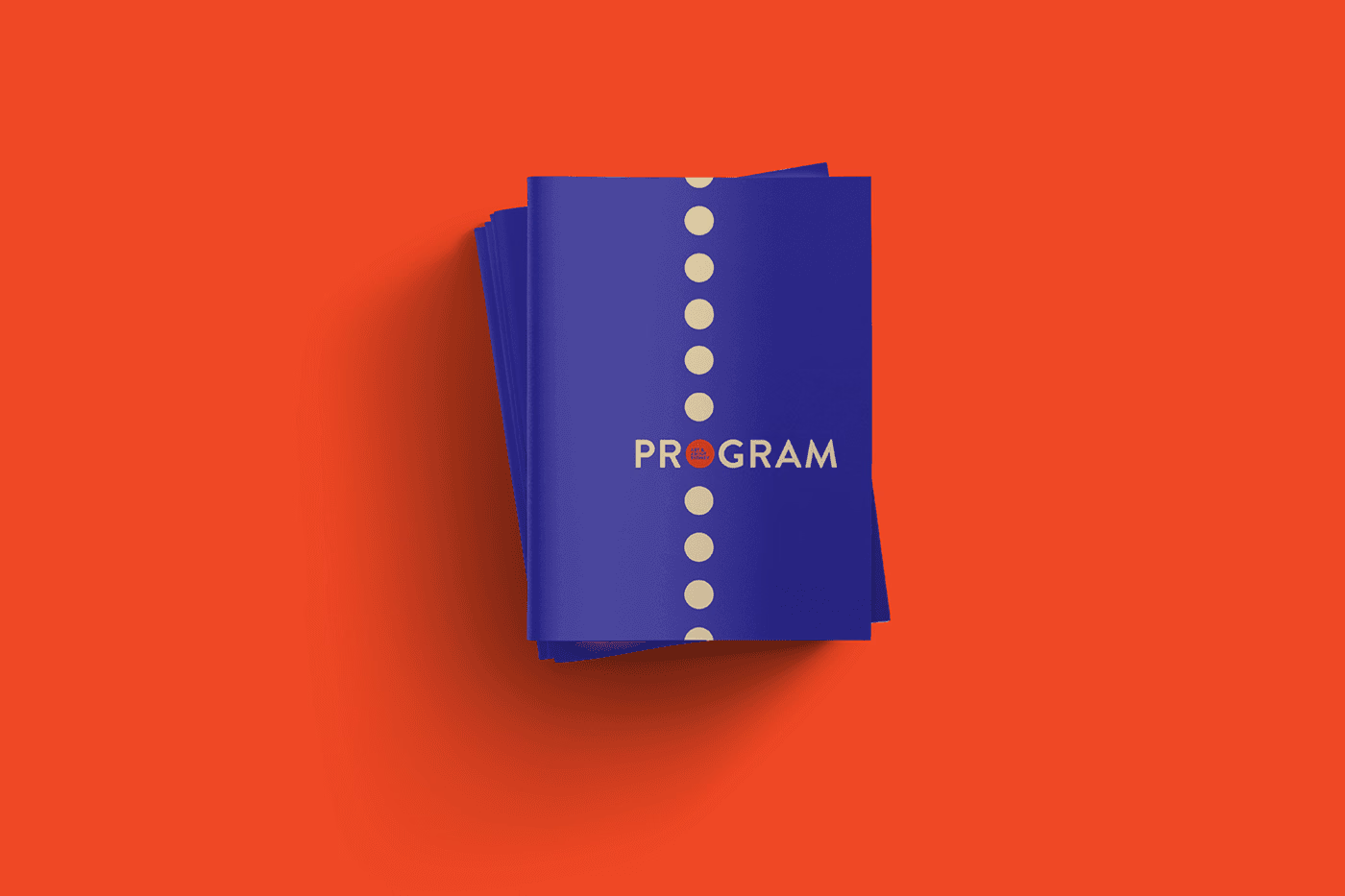
Stack of purple program booklets with a vertical dot motif.
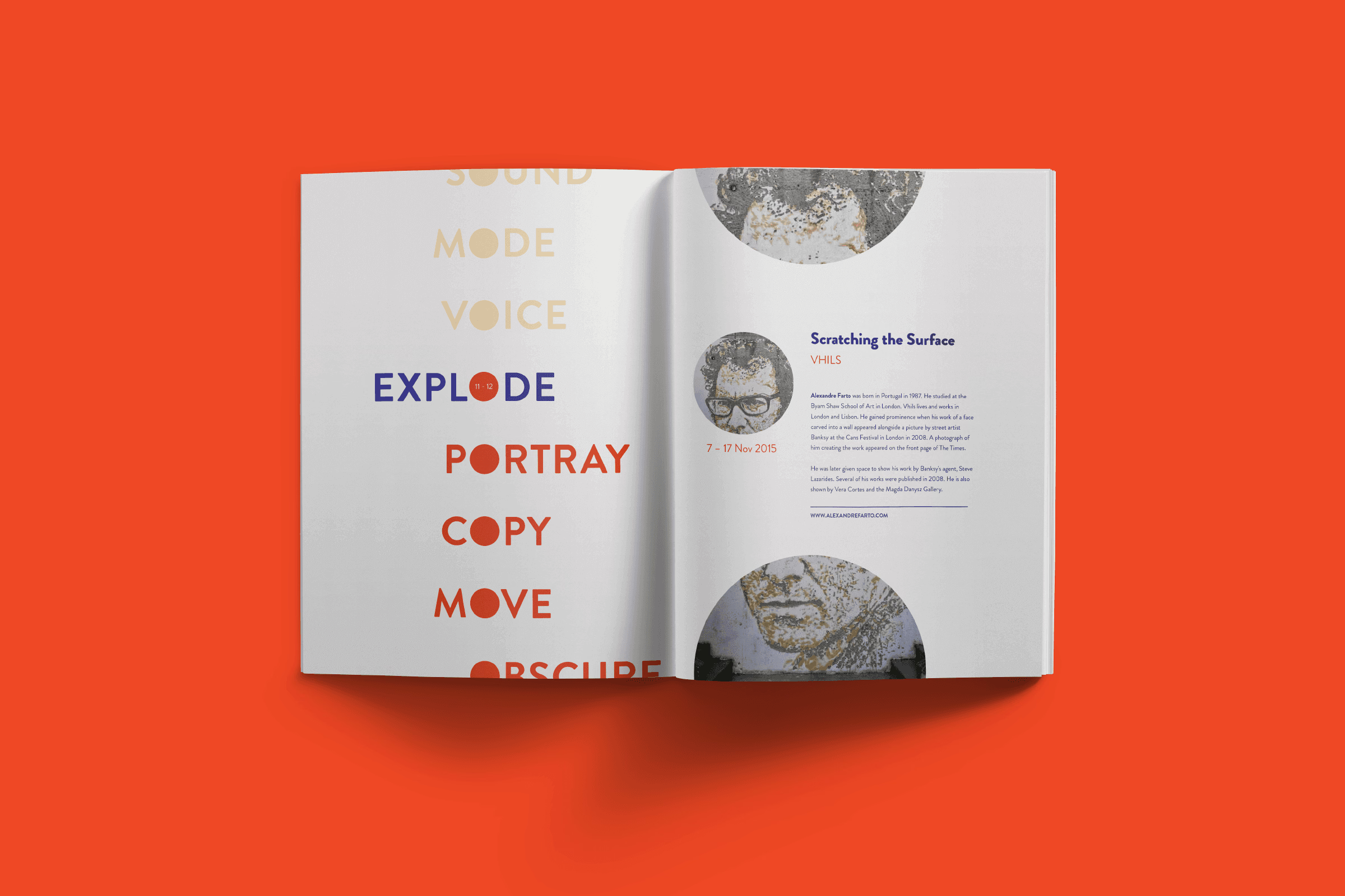
Open program spread with multicoloured typography and circular images.
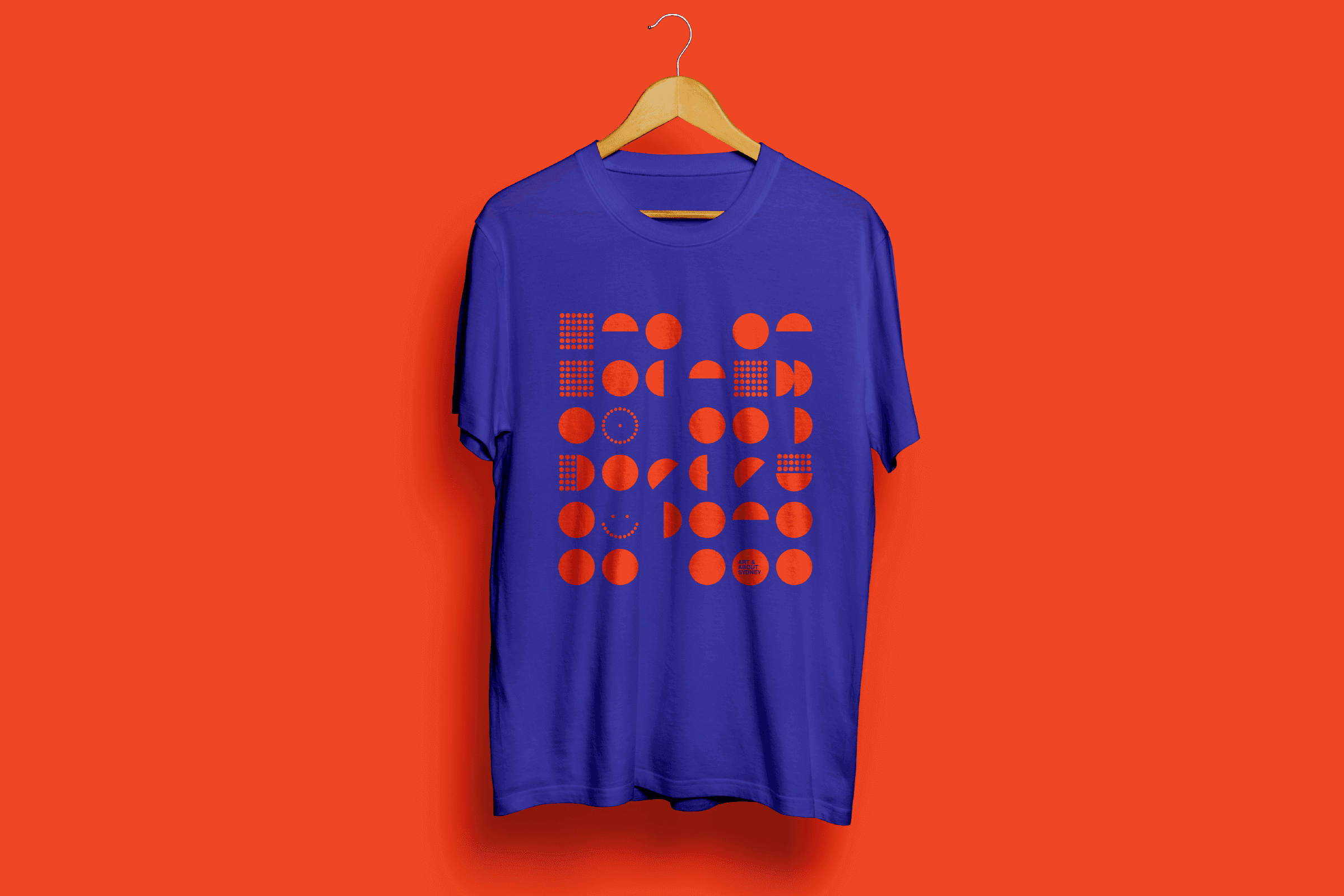
Purple T-shirt printed with orange circular patterns.
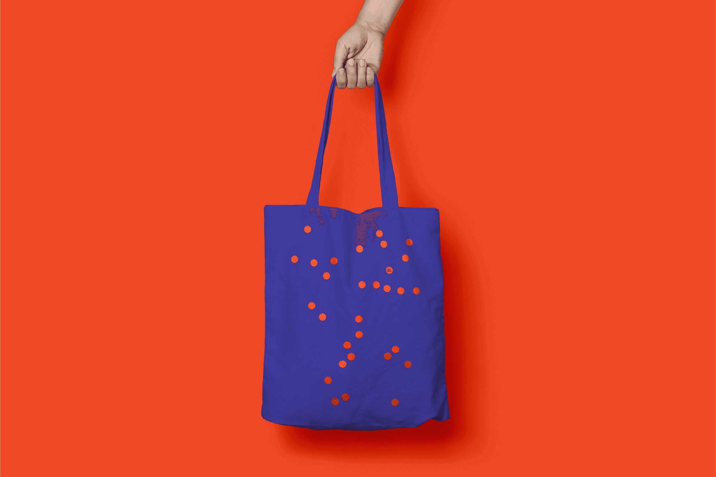
Purple tote bag with a scattered orange and cream dot pattern.